TLDR
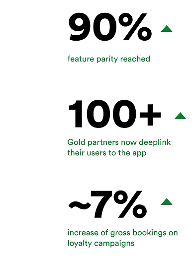
While strategic and affiliate partners are pivoting their focus on mobile-first experiences, my product team and I looked to match all our offerings and features to the Booking app, driving cross-platform parity from 25% to 90%in 2 years.
TEAM
Solo designer with a product manager, product marketing manager, 4+ developers
ROLE
Led and decided on the UX and research, aligned with all stakeholders needed, delivered designs and research analysis
TIMELINE
On and off for 2 years
APPROACH
Define
Scope definition
Defining goals
Identifying needed methods
Assess
Feature desktop audit
Stakeholder identification
Touchpoint mapping
Design
Explorations
Cross-functional alignment
Prototyping
Delivery
Evaluate
User testing
Experimentation
Analysis and insight extraction
Next step definition
CONTEXT


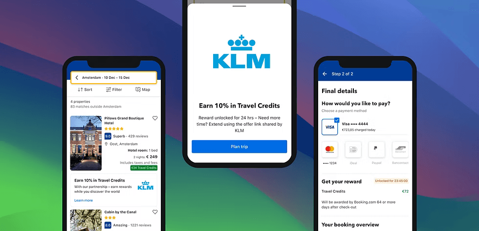
White labels and
co-brands
to enforce the partnership to the consumers' eyes

Reward campaigns
where consumers can get miles and loyalty points, Booking credits, or instant discounts
Want to see it in action?
Live experience
PROBLEM
All these features have existed for years on the desktop and mobile browser experience
OPPORTUNITIES
More than 80% of gross bookings are now made through the Booking app
Partners are shifting their priorities and building mobile-first products - seeking an end-to-end seamless journey from their mobile platform to ours
Feature parity between desktop and app is at 20% for partnerships consumer-facing products
EXPECTED IMPACT
By building products and features that already exist on the app, we increase the 80% share of gross bookings and earn the loyalty of partners prioritizing mobile experiences

Real estate was limited - the fixed banner throughout the flow would take up significant space
All components and visual touch points guiding the user through the flow had to be less-intrusive, and more visually efficient to avoid constraints
CHALLENGE
Poor communication and execution of touch points when consumers are promised rewards, can lead to increased customer support tickets and potential legal issues.

Cross-functional alignment

One design system and language

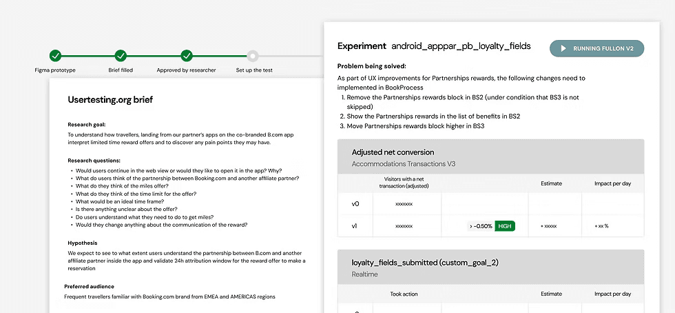
Unmoderated user testing - Led by me and supported by our researcher, we revealed pain points and needs, such as confusing copy elements ("Limited time offer", "Travel Credits"…)
Experimentation on our in-house tool - Booking is known for its heavy experimental environment, with its own in-house tool. Between non-inferiority tests, and tests with specific goals according to that specific traffic, we were able to gather data that guided future iterations.
Using the outcome - there was no alarming outcome, so gradually we went live feature by feature. As for more orange flag findings, with some prioritized based on the project strategy and launch timelines, and UX criticality
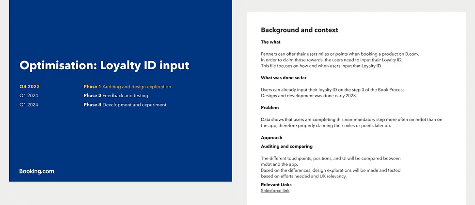
Redesigning based on bad data
A few months into launch, we monitored app performance metrics and compared them to web data to assess the impact of design changes on conversion, bookings, and customer support.

In retrospective
A project that taught me patience and that unlike fast-paced startups, there's a lot more that goes into building features. Finding the right dependencies in time and aligning accordingly eventually streamlined my work.
Cross-platform parity ≠ Same components and IA
Not only due to the difference in real estate, but also to the expected behavior and capabilities a native app can offer as opposed to a browser experience
Design deliverables have an expiry date
Due to the slow production process and technical blockers in some of the features, a year would pass before they look at the front-end. By that time, I needed to review the UX and make sure it still aligns with any changes on any screen through the flow.
Different screens, different owners
While I designed touch points for one end-to-end funnel, each screen and stage on that funnel was owned by a different team and different designers.
They often work differently, expect different alignment approaches; and so adaptability to achieve my goals was key.