Building affiliate products for scale
TLDR
Booking's affiliate program empowers over 30,000 strategic partners to earn commission by promoting our products. While our suite of traffic-generating tools is valuable, many remain inaccessible to lower-tier partners due to manual creation and resource constraints.
TEAM
Solo designer with a product manager and 3 software developers
ROLE
Led the design and research phase, helped with the product restructure, contributed to the product roadmap, delivered in scope and prepared handoff
TIMELINE
1 year
APPROACH
Define
Scope definition
Defining goals
Identifying needed methods
Assess
Feature parity audit
Stakeholder identification
Touchpoint mapping
Design
Explorations
Cross-functional alignment
Prototyping
Delivery
Evaluate
User testing
Experimentation
Analysis and insight extraction
Next step definition
CONTEXT

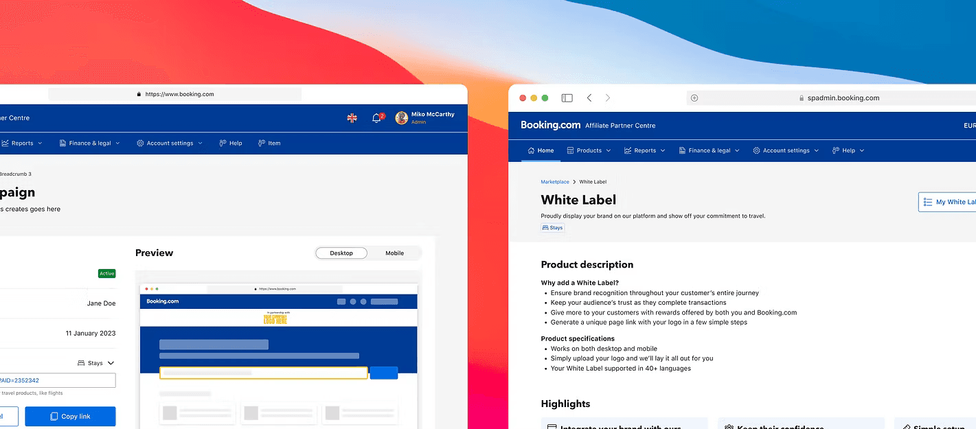
Pre-landing products
Embedded search box widgets, map widgets, banners, etc are the touchpoint that bring the users to the Booking site and environment. Some of them are interactive and can be customized, while others remain static.
Landing products
Co-brands, hybrids, etc are Booking landing pages attached to the partner's ID to help them track their commission and affiliate bookings.

Outcome
Overall higher ROI
Considerable decrease in time to launch and in costs -knowing that today, account managers and web designers manually build each customized Booking page.

OBSTACLE
To most partners in lower tiers and no account managers, many of these products are unheard of and may seem complex to introduce.


1
One of the outcomes
We realized partners view and understand these landing products differently than we do, starting with taxonomy
2
Action taken
This discovery had me push back the timeline and roadmap of the project, as I felt the need to dig more and better listen to our partners in order to bridge the gap between their knowledge and expectations and our internal product structure.
3
Understanding the industry standard
I also thoroughly reviewed competitors and identified patterns across their affiliate platforms that helped me realize Booking's misalignment with industry standards, immediately making it harder for partners to understand and integrate our products should they stay as is.


DISCOVERY
They just offer different levels of configuration. Understanding that minor difference helped me make the simplification and standardization process tremendously easier. I only had to explain one new product to the user for example, reducing that cognitive overload risk.


With a biweekly call in place and having agreed on working ways, they owned the mapping aspect and shared with us any outcome they had during that catch-up.
This organised collaboration and divided ownership streamlined the results we expected. It was now easier than ever to visualise and identify patterns and configuration points to be used in the self-serve flow later on.
A design system at my disposal
I would also use and re-use, at maximal capacity, existing library components. That not only ensure consistency in design language across all Booking products, but it also helps development and makes the production process a lot faster.


TECH SAID NO
One of those big issues was discovering the inability to in fact display a live preview while configuring. That meant the UX had to be adapted, lots of white space would be created, and most importantly: the partner will have no idea what the product they're configuring is or looks like, especially knowing it's a brand new tool.
PATTERN CREATION
In many instances, UX had to be adapted. These adaptations turned into product patterns that could be re-used by other designers in the future when facing similar technical restrictions.

Impact
While it took us a year to reach the final vision and first iteration, we were able to build a simple and relevant user experience that is scalable and saves the business both resources and time.
We greatly improved our main partner equity metric by giving them access to new products that will help them generate better commission revenue. By giving them that access, we also gained their loyalty by giving them better control and visibility over the products they showcase to their user base.
Next steps
I had to handover this year worth of work to my teammate as I started supporting a different product teams. It was a successful challenge to onboard her and bring her up-to-date on this complex project that still has a long way to go.
Today, she is working on the next iteration and we catch up weekly to discuss the latest updates and check up with me on the paths the project is taking.
In retrospective
This project taught me the tough behind the scenes of technically complex products. And finding the right balance between pushing back for the sake of good UX and adapting to technical restrictions is essential.
Have a product voice, not just UX
I was initially asked to just make the product self-serve as is. Its restructure was the fruit of the research I had led, and which pushed me to fight the roadmap and the product as a whole.
Introducing complex ideas to the users
With high collaboration with our UX writer, we deep dove into making sure the partner building their co-branded landing page understands the purpose and the ho-to.